The New York Times redesigns its app to highlight a universe beyond just news

The New York Times redesigns its app to highlight a universe beyond just news

I’ve had the New York Times app on my phone for pretty much as long as I’ve had a smartphone, and my experience of it has remained mostly the same over the years. A main tab served up the news of the moment, and a few other buttons existed for tabs that I rarely used, other than to occasionally dig through the “sections” tab when I was looking for something specific. Over the years, encouraged by the Times itself, I’ve added the company’s other apps to my phone as well; I check the Athletic app for tennis and Formula One news, send my Connections solves to my friends from the Games app, and find recipes in the Cooking app. Last year, the paper also launched an audio app.
The idea seemed to be that each of the Times’ offerings was its own, separate planet in the Gray Lady’s solar system: come to the main New York Times app for the news, and go to the other apps for the other things (though audio and games, no doubt thanks to the popularity of The Daily, Connections, and Wordle, have their dedicated tabs in the Times app, too). But a new redesign, which started rolling out to some users earlier this week and officially launches Wednesday, is changing all of that. It’s the first major Times app redesign since the app first launched in 2008.

“We hear from readers a lot about how we produce so much awesome journalism, and it’s really hard to find it all,” Emily Withrow, SVP of product at the Times, told me. “It’s a classic problem of real estate. Oftentimes we are tied to [having] something once a day on the home screen that then is displaced by something else.”

The solution, then, was to create more home screens.

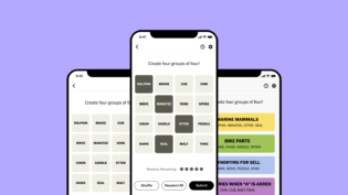
In the redesigned app, there are still four tabs — “home,” “listen,” “play,” and “you,” where users can follow topics they’re interested in — at the bottom, but a bar at the top of the home tab presents a list of sections that users can swipe through. Swiping to the right takes users to sections from the Times’ core product — “Great Reads,” Lifestyle, Opinion. (There’s also a section for the 2024 election; it will likely be replaced by another topical section after November). Swiping to the left, meanwhile, takes users to the Times’ sub-brands: The Athletic, Cooking, Wirecutter, and Games.

The redesign isn’t meant to replace or phase out the other apps the Times has built over the years. In the main app, the sections for each sub-brand will not be as fully featured as the standalone apps. The cooking section, for example, will surface recipes but link out to the Cooking app for features like the recipe box.

“We’re not building a mega app,” said Kristen Dudish, VP of product design at the Times. “We’re kind of giving you a preview of everything, so that you can discover them within the news app as part of the New York Times universe.”

The redesigned app is meant to be the entry point into everything the Times can offer — particularly if you have an all-access subscription, which, as we’ve noted before, the company has been pushing. (As of August, more than half the Times’ 10.2 million digital-only subscribers were paying for more than one Times product.) And it is increasingly the method by which most people experience the Times’ journalism; subscribers spend twice as much time in the app as on the website, and it tends to be the channel that drives the most active days. The vast majority (90%) of people who open the app one week will return to it the next.

For an all-access user swiping through the app, the message is “these are all the things you’re getting.” Someone who might only subscribe to one or two of the Times’ products, on the other hand, will be able to swipe through all the sections and read the headlines like an all-access subscriber, but hit the paywall once they try accessing content their subscription doesn’t provide access to; the message for them, essentially, is “these are all the things you’re missing.”

The app is also a showcase of the Times’ standing as not just a news company but a tech company in its own right. It employs hundreds of software engineers across various teams, and the company has been in prolonged contract negotiations with the Times Tech Guild, which represents 600 members; the union recently threatened to go on strike on Election Day. In a statement, a spokesperson for the Times said that they “respect the rights of our colleagues in the TechGuild to engage in protected actions” and added that there “was no restructuring of teams for the new Times app redesign launch.”

In some ways, the experience reminded me of the feeling of getting a hefty Sunday paper and sifting through the supplements. But it also reminded me of switching between feeds on Bluesky or X, which Withrow and Dudish acknowledged themselves; they themselves often referred to the sections as “feeds,” albeit ones with more of a (human) editorial hand shaping them.

The redesign takes inspiration from social media in other ways, too. “We believe the vast majority of people who are opening our app right now are looking for something to read. Sometimes that’s something very serious, and sometimes it’s a viral bad art friend story,” Withrow said. “But people often switch modes very quickly. They’re more accustomed to seeing something really silly next to something really serious because of their social media feeds. You’ll be in a reading mode, and then you’ll sort of fall into a video mode at the right moment because you’re interested in a piece of content [that showed up in your feed].”

“What we’re trying to say,” she added, “is that we have many other modes besides just reading.”

This story was updated on October 3 with a statement from the New York Times about tech workers. 


2024-10-01 14:25:00

Name is the most famous version in the series of publisher
Publisher
Genre games news
Version
Update ديسمبر 8, 2024
Get it On Google Play
Download

I’ve had the New York Times app on my phone for pretty much as long as I’ve had a smartphone, and my experience of it has remained mostly the same over the years. A main tab served up the news of the moment, and a few other buttons existed for tabs that I rarely used, other than to occasionally dig through the “sections” tab when I was looking for something specific. Over the years, encouraged by the Times itself, I’ve added the company’s other apps to my phone as well; I check the Athletic app for tennis and Formula One news, send my Connections solves to my friends from the Games app, and find recipes in the Cooking app. Last year, the paper also launched an audio app.

Thank you for reading this post, don't forget to subscribe!

The idea seemed to be that each of the Times’ offerings was its own, separate planet in the Gray Lady’s solar system: come to the main New York Times app for the news, and go to the other apps for the other things (though audio and games, no doubt thanks to the popularity of The Daily, Connections, and Wordle, have their dedicated tabs in the Times app, too). But a new redesign, which started rolling out to some users earlier this week and officially launches Wednesday, is changing all of that. It’s the first major Times app redesign since the app first launched in 2008.

“We hear from readers a lot about how we produce so much awesome journalism, and it’s really hard to find it all,” Emily Withrow, SVP of product at the Times, told me. “It’s a classic problem of real estate. Oftentimes we are tied to [having] something once a day on the home screen that then is displaced by something else.”

The solution, then, was to create more home screens.

In the redesigned app, there are still four tabs — “home,” “listen,” “play,” and “you,” where users can follow topics they’re interested in — at the bottom, but a bar at the top of the home tab presents a list of sections that users can swipe through. Swiping to the right takes users to sections from the Times’ core product — “Great Reads,” Lifestyle, Opinion. (There’s also a section for the 2024 election; it will likely be replaced by another topical section after November). Swiping to the left, meanwhile, takes users to the Times’ sub-brands: The Athletic, Cooking, Wirecutter, and Games.

The redesign isn’t meant to replace or phase out the other apps the Times has built over the years. In the main app, the sections for each sub-brand will not be as fully featured as the standalone apps. The cooking section, for example, will surface recipes but link out to the Cooking app for features like the recipe box.

“We’re not building a mega app,” said Kristen Dudish, VP of product design at the Times. “We’re kind of giving you a preview of everything, so that you can discover them within the news app as part of the New York Times universe.”

The redesigned app is meant to be the entry point into everything the Times can offer — particularly if you have an all-access subscription, which, as we’ve noted before, the company has been pushing. (As of August, more than half the Times’ 10.2 million digital-only subscribers were paying for more than one Times product.) And it is increasingly the method by which most people experience the Times’ journalism; subscribers spend twice as much time in the app as on the website, and it tends to be the channel that drives the most active days. The vast majority (90%) of people who open the app one week will return to it the next.

For an all-access user swiping through the app, the message is “these are all the things you’re getting.” Someone who might only subscribe to one or two of the Times’ products, on the other hand, will be able to swipe through all the sections and read the headlines like an all-access subscriber, but hit the paywall once they try accessing content their subscription doesn’t provide access to; the message for them, essentially, is “these are all the things you’re missing.”

The app is also a showcase of the Times’ standing as not just a news company but a tech company in its own right. It employs hundreds of software engineers across various teams, and the company has been in prolonged contract negotiations with the Times Tech Guild, which represents 600 members; the union recently threatened to go on strike on Election Day. In a statement, a spokesperson for the Times said that they “respect the rights of our colleagues in the TechGuild to engage in protected actions” and added that there “was no restructuring of teams for the new Times app redesign launch.”

In some ways, the experience reminded me of the feeling of getting a hefty Sunday paper and sifting through the supplements. But it also reminded me of switching between feeds on Bluesky or X, which Withrow and Dudish acknowledged themselves; they themselves often referred to the sections as “feeds,” albeit ones with more of a (human) editorial hand shaping them.

The redesign takes inspiration from social media in other ways, too. “We believe the vast majority of people who are opening our app right now are looking for something to read. Sometimes that’s something very serious, and sometimes it’s a viral bad art friend story,” Withrow said. “But people often switch modes very quickly. They’re more accustomed to seeing something really silly next to something really serious because of their social media feeds. You’ll be in a reading mode, and then you’ll sort of fall into a video mode at the right moment because you’re interested in a piece of content [that showed up in your feed].”

“What we’re trying to say,” she added, “is that we have many other modes besides just reading.”

This story was updated on October 3 with a statement from the New York Times about tech workers. 

2024-10-01 14:25:00

 
Report
Rating

0

( 0 Votes )
Please Rate!

No votes so far! Be the first to rate this post.


You are now ready to download for free. Here are some notes:

  • يرجى مراجعة دليل التثبيت الخاص بنا.
  • للتحقق من وحدة المعالجة المركزية ووحدة معالجة الرسومات لجهاز Android، يرجى استخدام تطبيق CPU-Z

Leave a Comment